Rethinking Bank Offers
for Goibibo
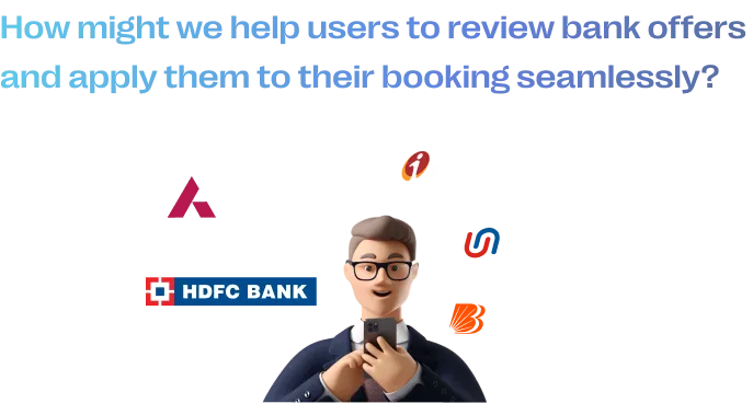
Improving Bank offers section to enable users to browse through offers and
apply them to their bookings effortlessly.
Improving Bank offers section to enable users to browse through offers and
apply them to their bookings effortlessly.
People usually browse through bank offers to identify the highest discounts offered by banks with whom they are associated and then apply them to their booking. The current bank offers section doesn't expedite this behaviour. This is a UX problem because users are less likely to make a transaction if they can't grasp the actual value being offered clearly.
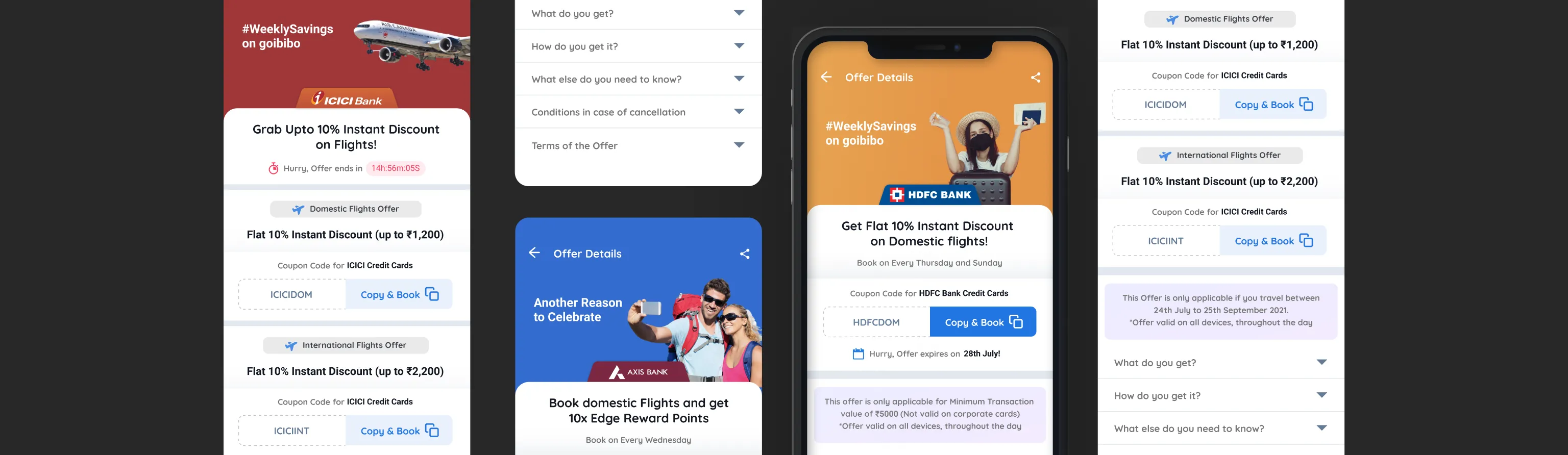
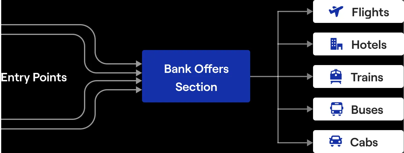
Users can enter this section from the Bank website, GI offers section and social media channels or even through advertisements. After inspecting the offer, they can get directed to one of the LOB landing pages and become a shopper (User with the intent of booking).
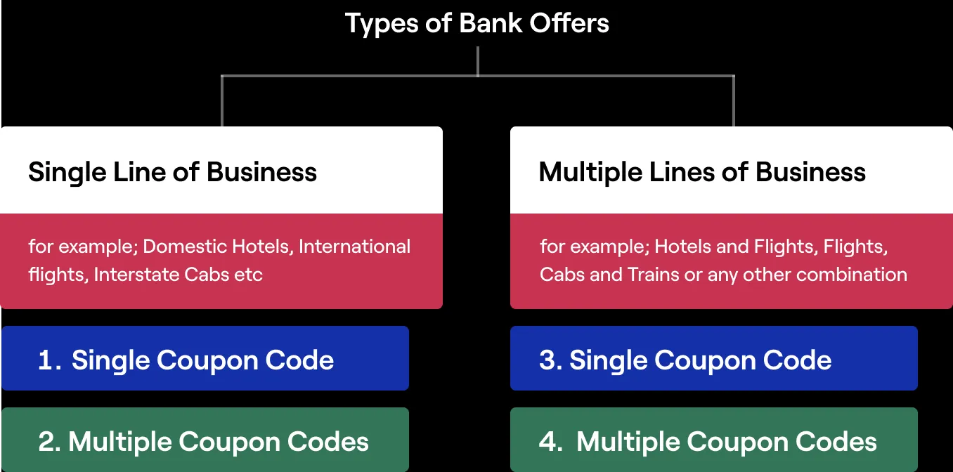
During the Initial stakeholder discussions, I met the Marketing Team. They are accountable for constructing these offer pages using a software called PageMaker. I asked them for their concerns and the kind of offers they receive from Banks. I was able to consolidate all of those offers into Four categories:
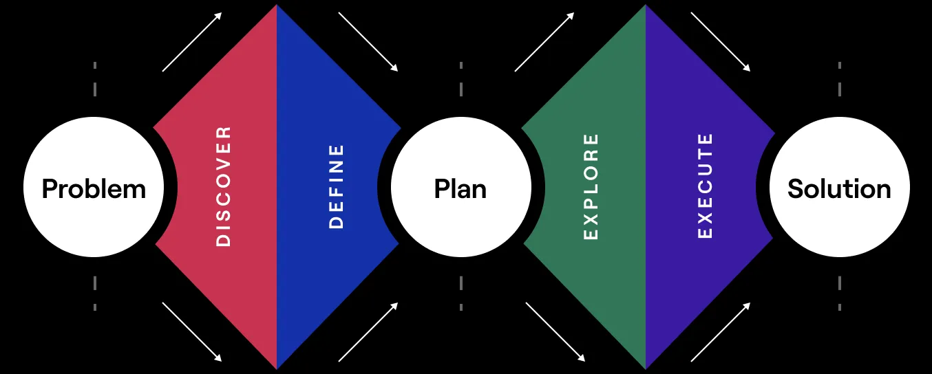
It is almost impossible to set up a rigid process and follow it for every situation but I think having an outline of the design process is a necessary constraint:
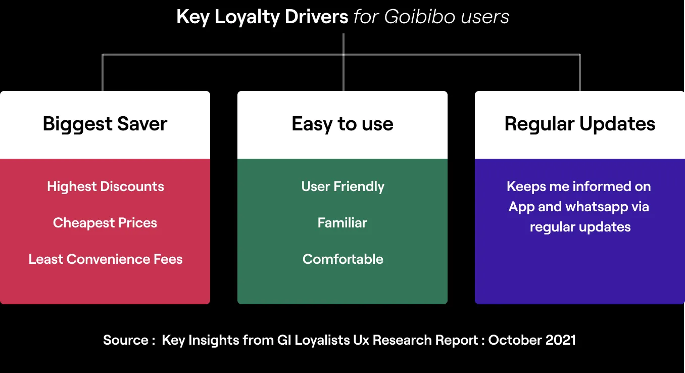
To comprehend why users chose Goibibo over the alternatives in the market and what makes the product unique, I referred to a research report by our in-house UX research team. This helped me discover the user expectations from the brand.
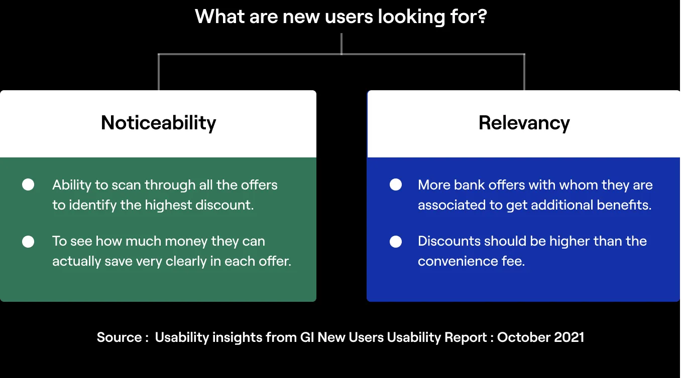
Then, To find out what our users are looking for while browsing bank offers. I referred to another Usability study that mapped new user experiences for Goibibo.
The Bank Offers section usually gets a lot of sessions on all platforms. Hence, Business had an explicit goal - to improve the overall metrics of the page so that this page can be utilised to get more transactions and revenue:
Our goal was to ensure that we designed to solve real problems of the user and not just sweeten the metrics. We wanted to create a solution that provides authentic value to the user.
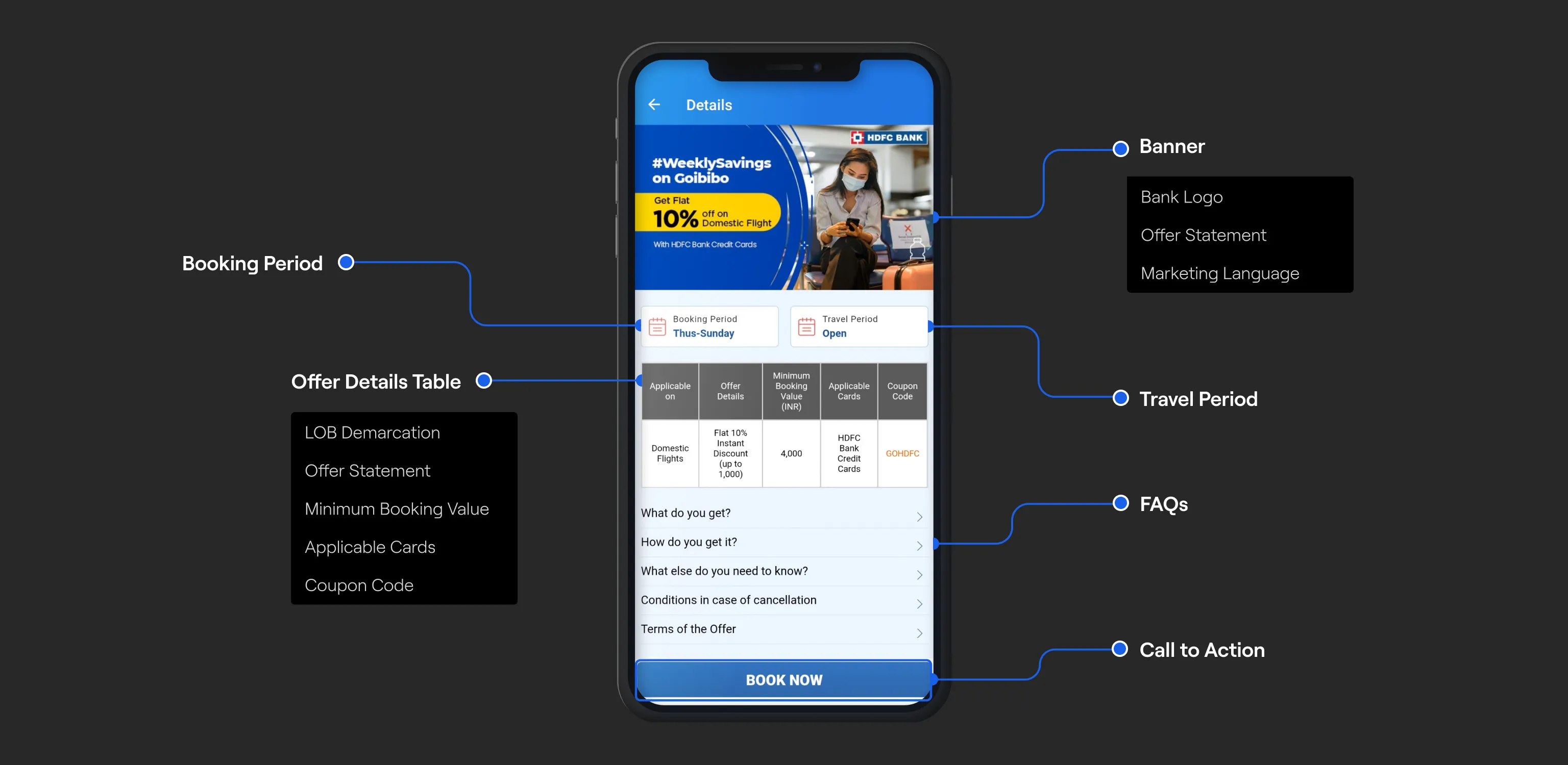
It was time to enter the definition stage. There was probably a ton of thinking behind each decision in the original solution. I decided not to entirely dismiss it. I inspected and understood how everything worked and why it did.
Our customers will have to choose between Goibibo and its alternatives. Sometimes, even for the exact same offers. It's thus crucial to analyse what our competitors are doing to tackle this problem space. I identified some clear commonalities to compare distinct elements of the experience.
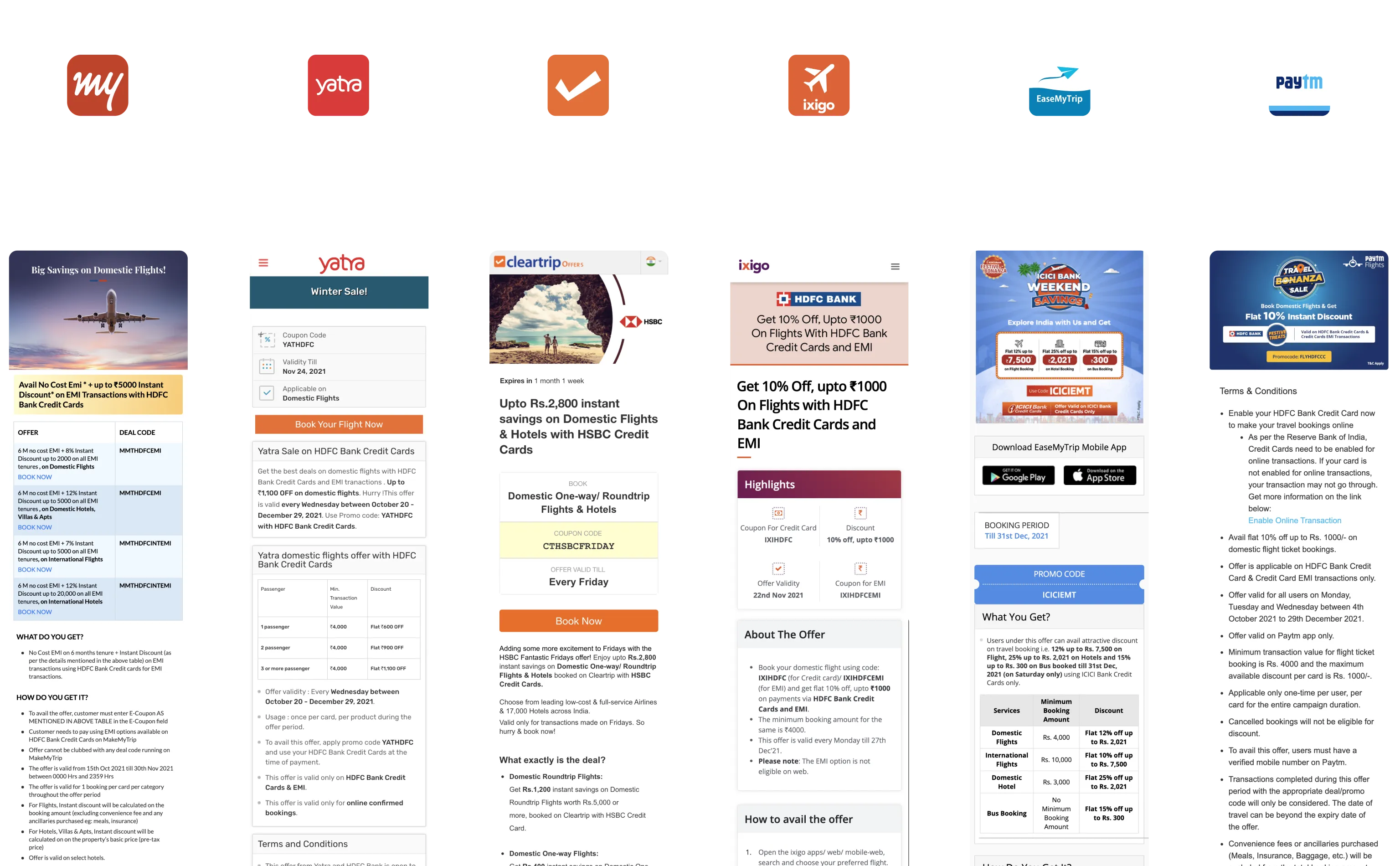
Later, I created a simple matrix where I listed the core information about the competition to understand how advanced their solutions are, what are they getting right and wrong. Then I compared the results with Goibibo's existing solution to get a high-level overview of where we stand.
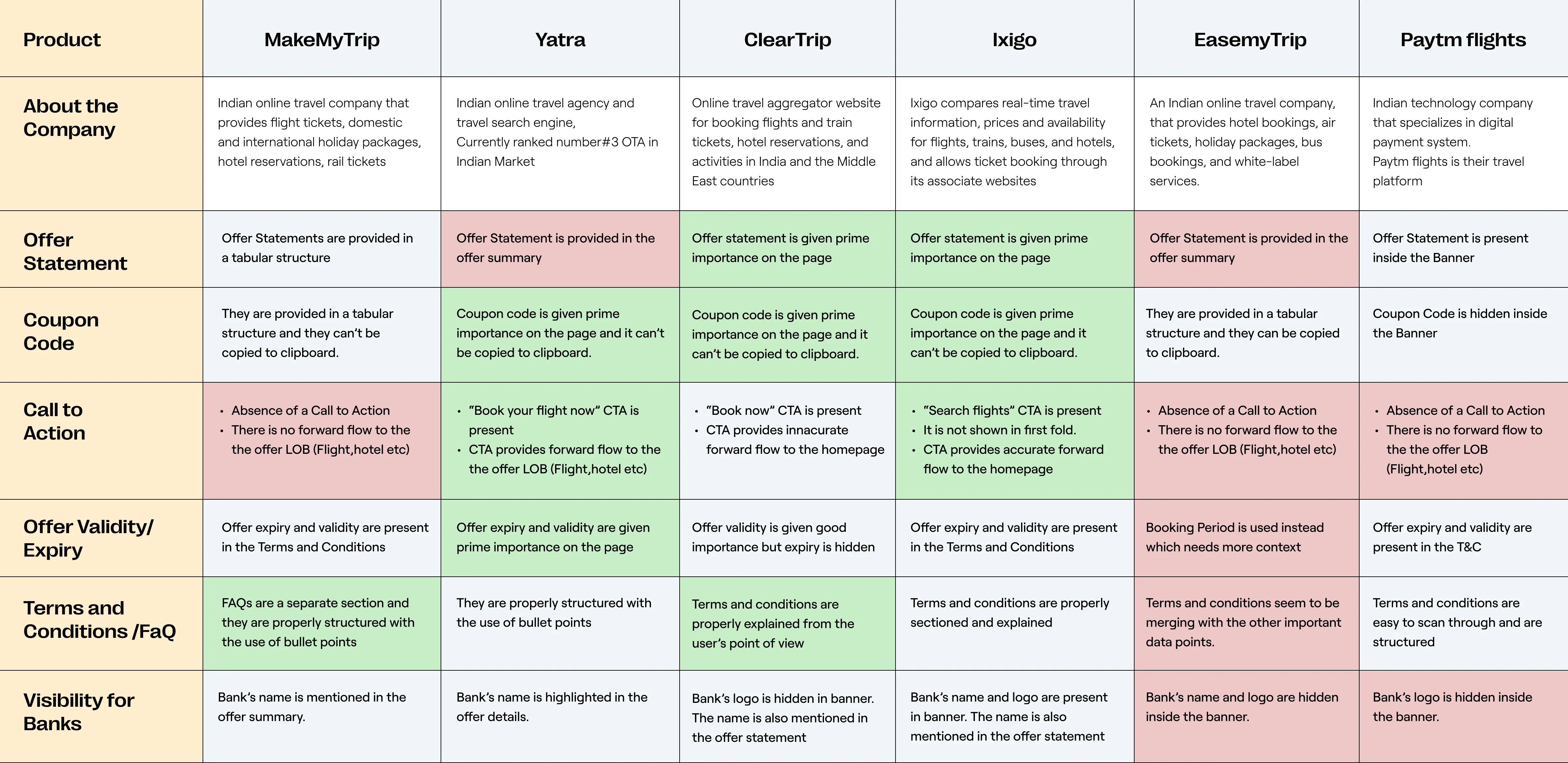
The competitive audit made me focus on the gaps in the current experience and helped me identify the most notable areas for improvement.
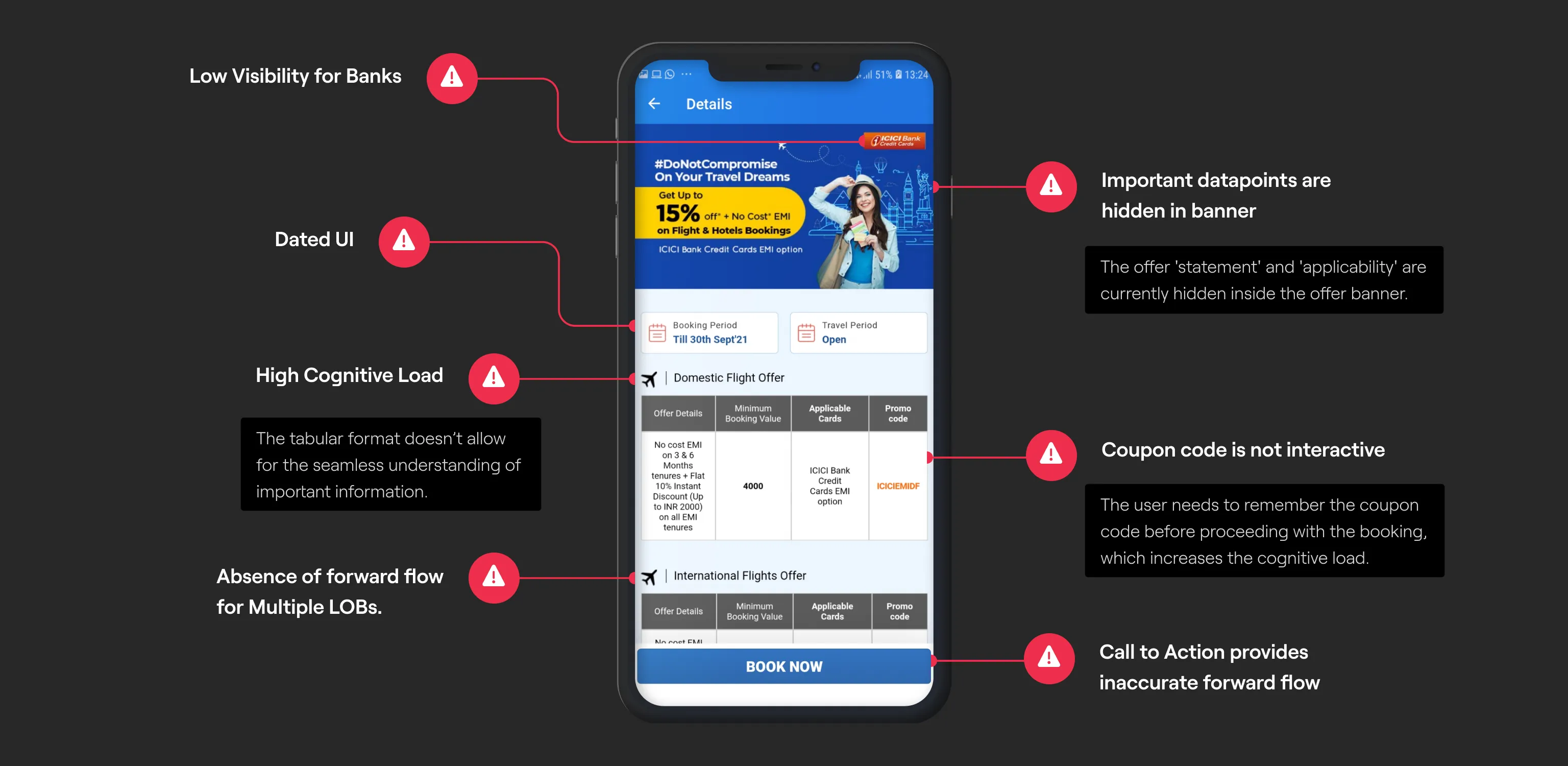
Based on the improvement areas identified, I started to define the requirements of the new design:
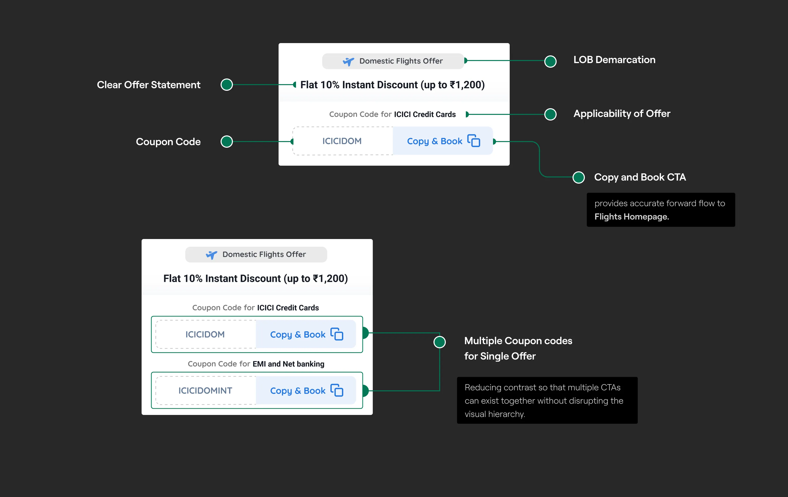
After I got a clear understanding of the solution requirements, I started iterating using low fidelity wireframes. I tried to omit data points that were not driving the user's ability to understand the offered value. All of the iterations were compared based on the overall scan-ability and Information hierarchy of the page.
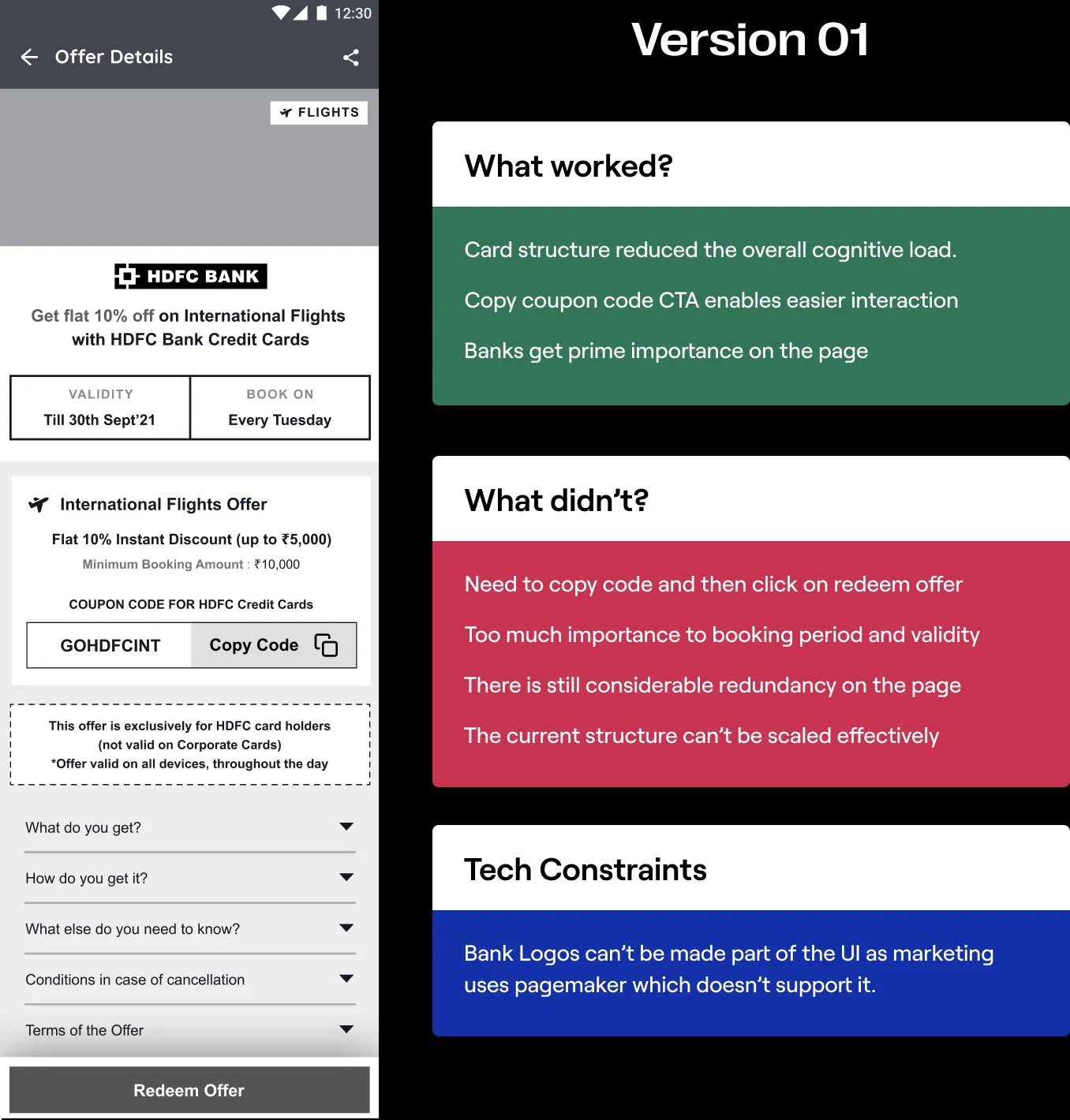
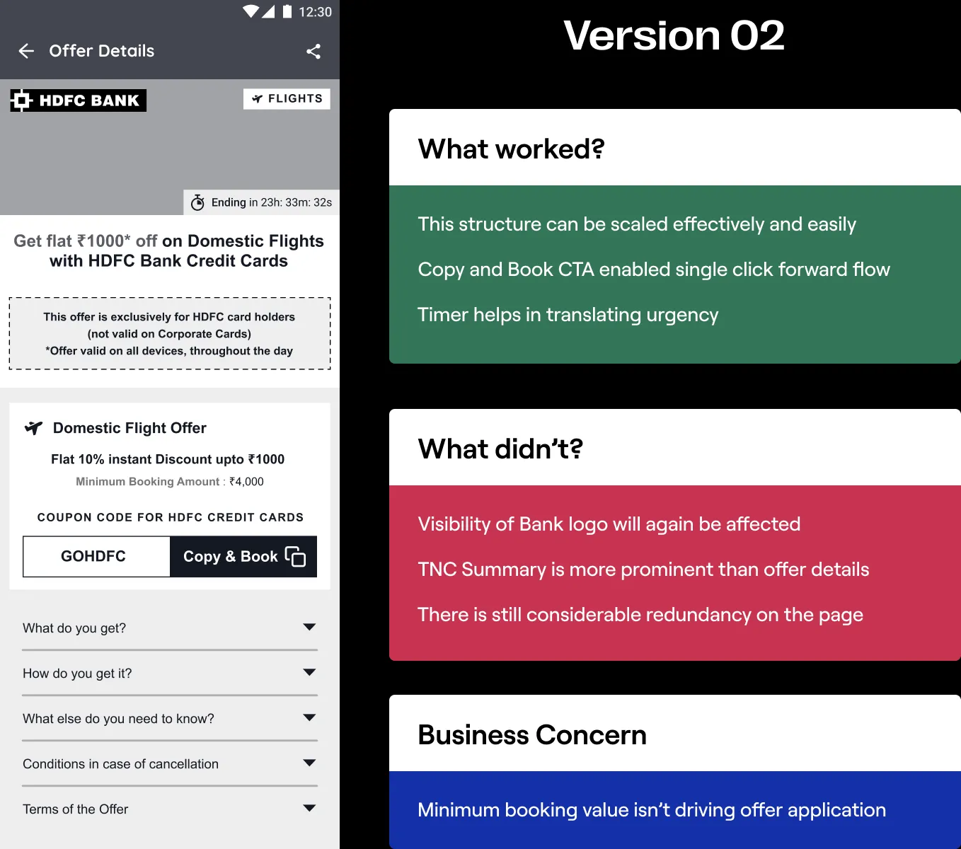
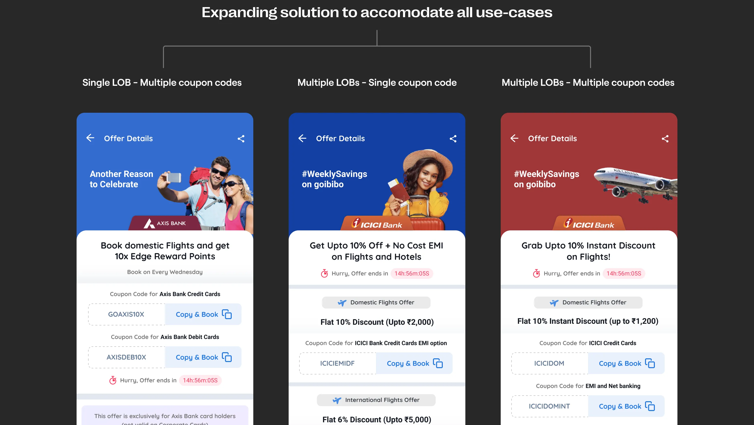
The new structure used to showcase offer details eases the overall cognitive load while also being scalable enough to accommodate the remaining use-cases.
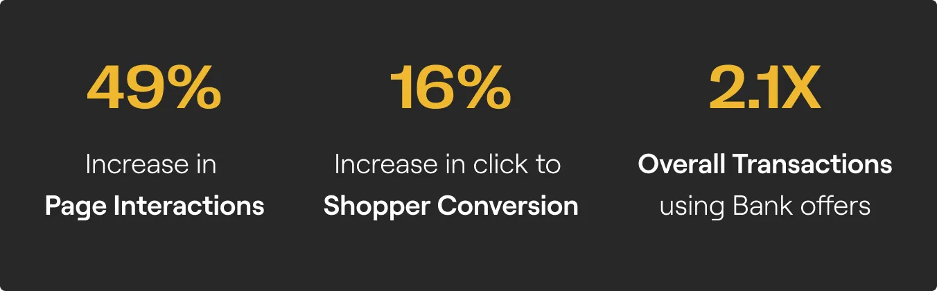
The redesigned bank offers page had a positive impact on the customer experience. Users are now interacting in impressive numbers with the page and completing more transactions. The Overall drop-offs from this page have considerably reduced. Here are some quick stats from one week after the launch: