Revamping flight search
experience for Goibibo
2021 was a year of notable development for Goibibo’s Desktop Homepage.
For the past three years, the widget was intact. On 23rd August 2021, we decided to change that.
2021 was a year of notable development for Goibibo’s Desktop Homepage.
For the past three years, the widget was intact. On 23rd August 2021, we decided to change that.
June 2021 - November 2021
Goibibo is an online travel agency that allows users to research and book flights, hotels, trains, cabs and buses. With 11 Million Monthly active users, It is the second-largest travel brand in India.

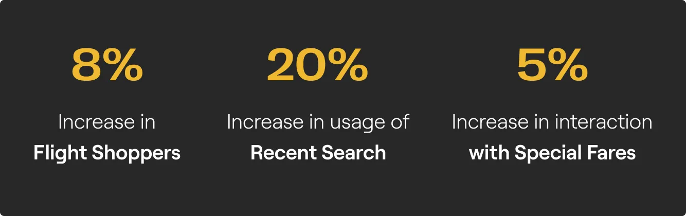
Widget interactions grew by 4% in the first week of release. We constantly monitored the click rate on various elements of the experience and the following were the key takeaways:
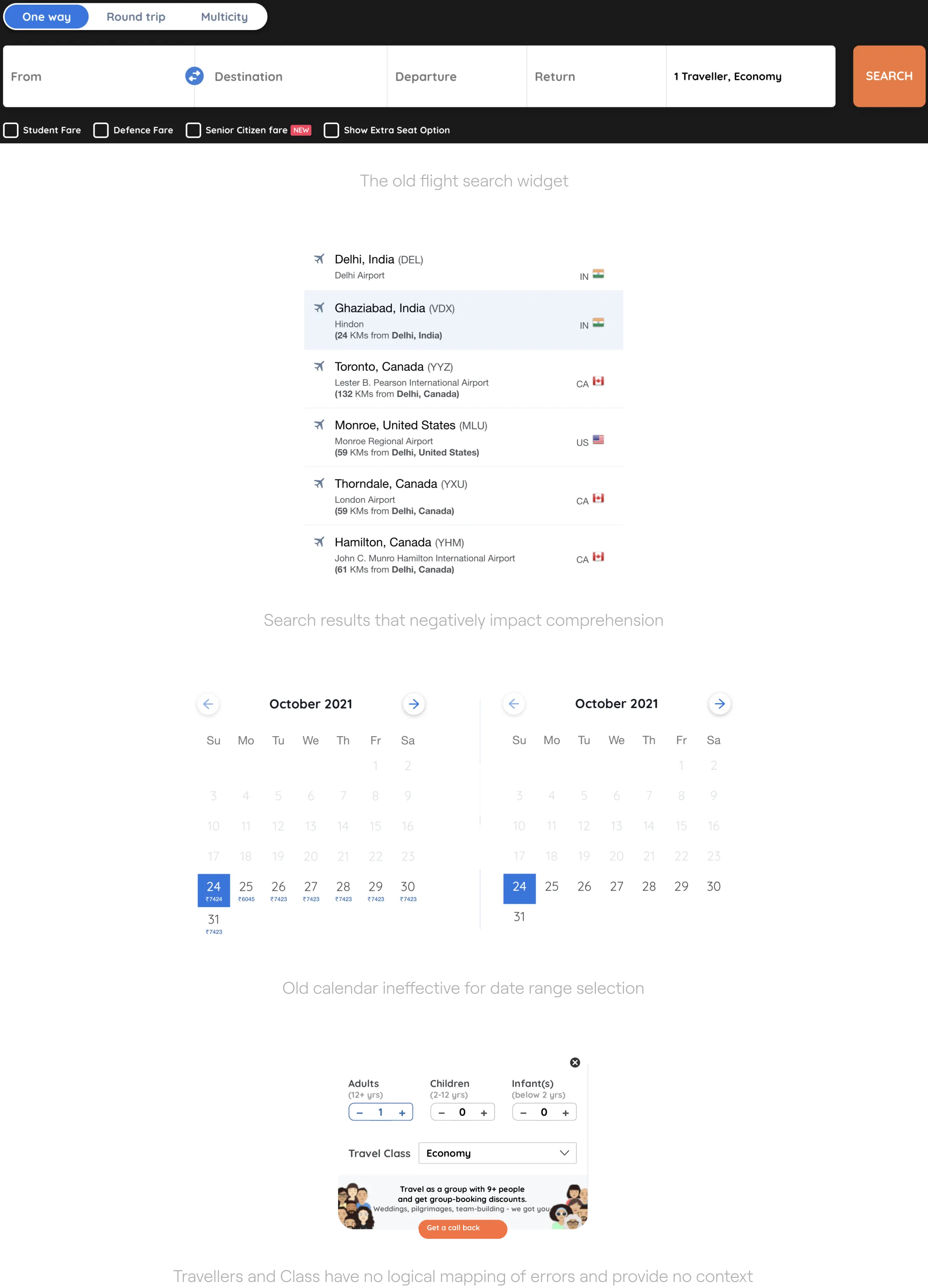
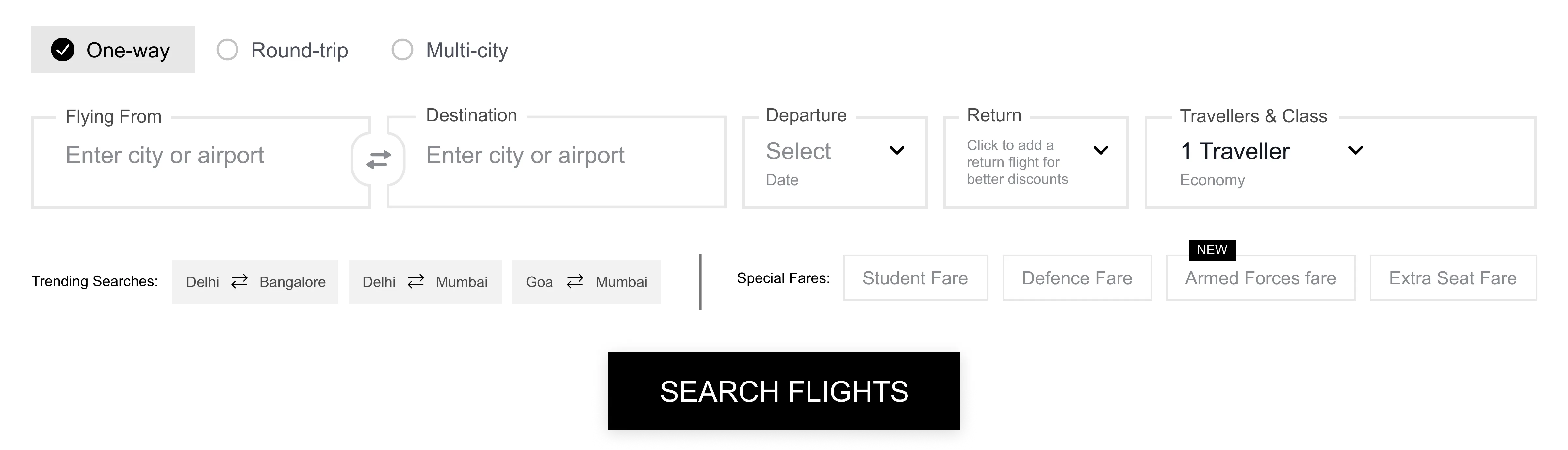
The flight search widget was never adequately designed from scratch. It was a result of lots of patchworks done throughout the years. Over time Goibibo’s user base evolved and, their expectations from the brand and travel products in general increased. The existing experience couldn’t scale with the emerging new features and use-cases.
🦸🏻 Widget is not the 'Hero'
of the page
Can we enhance the prominence of the widget and make it stand out on the page?
👀 Handling of Special fares and
Recent searches
Can we improve user engagement with special fares and recent searches?
⚠️ Non existent error handling
Can we reduce user anxieties during moments of failure and give them a clear way ahead?
🖥 Dated user interface
Can we reduce the critical usability issues which are a resultant of dated UI paradigms being followed?
We kicked off the process with a comprehensive review of the existing experience with the product team. The following were some of their expectations from the redesign:
Apart from defining the scope, the review also helped us dive into some focus areas for the redesign :
Scalable
widget should adapt to changes in content from back-end so that certain elements could be easily swapped in and out.
Accessible
We need to accommodate many potential users in many contexts of use.
Simple
Clean out the clutter and help users complete all required steps without unnecessary additions.
Cohesive
widget needs to fit in well with the look and feel of the other pages.
To visualise how a user interacts with the flights' search widget and look at the entire experience from the user's standpoint, We mapped the user journey. The purpose was to identify opportunities to offer situational relevance in our solution.
Then we initiated an exercise with the product team where we tried to predict problems that could have led to the existing metrics. Then we proposed solutions to these problems. This activity encouraged us to explore new areas for experimentation.
We focussed on translating the gaps in the current experience and the most notable user pain points, into a set of design requirements. To map these to each major step of the user journey, we used an affinity diagram.
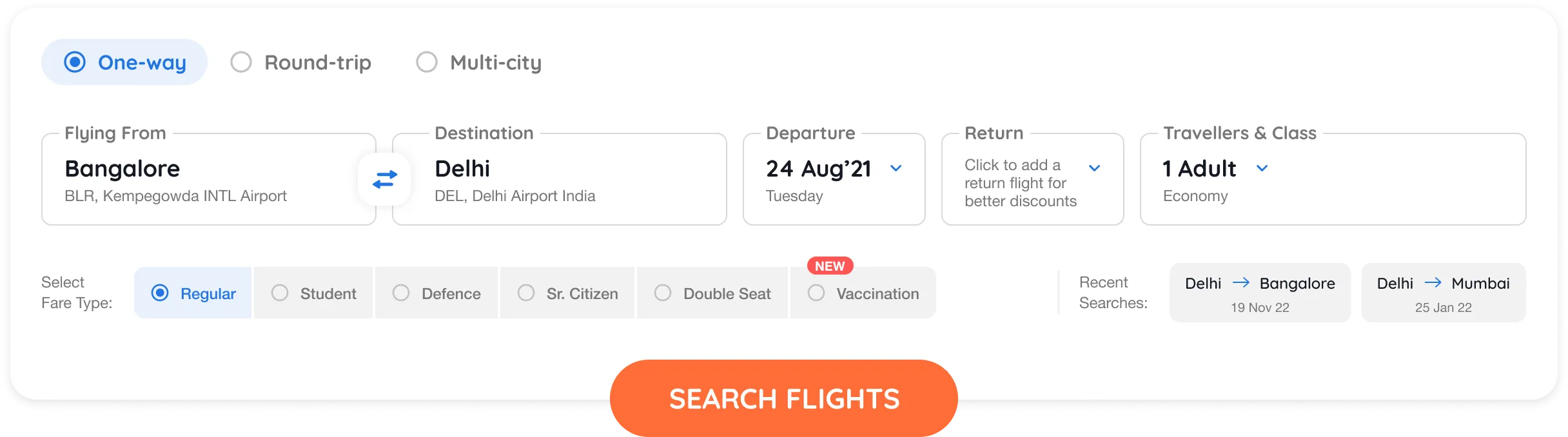
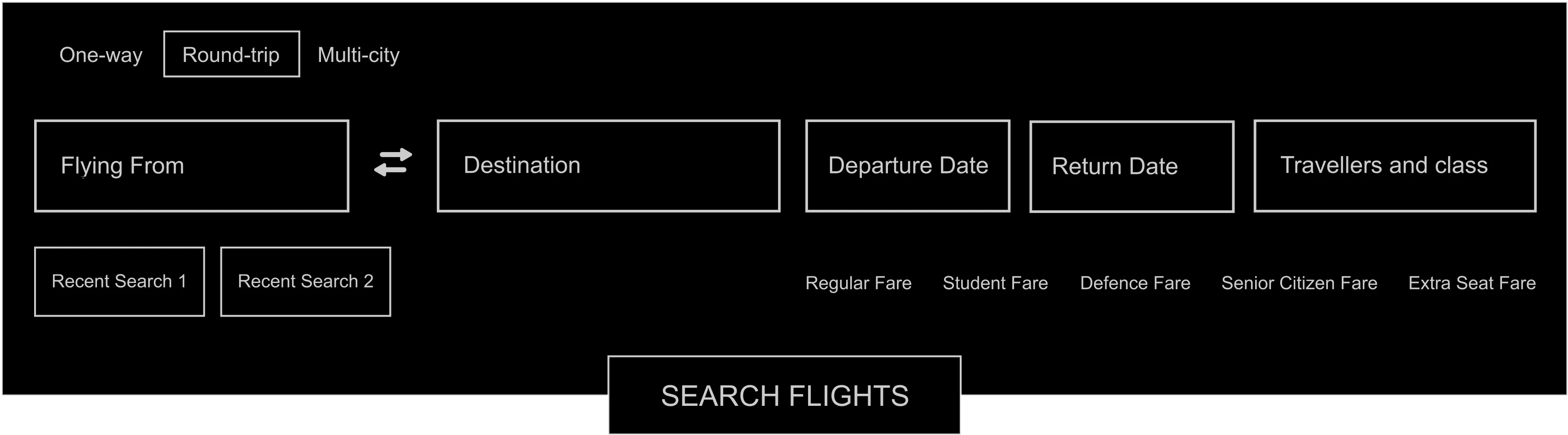
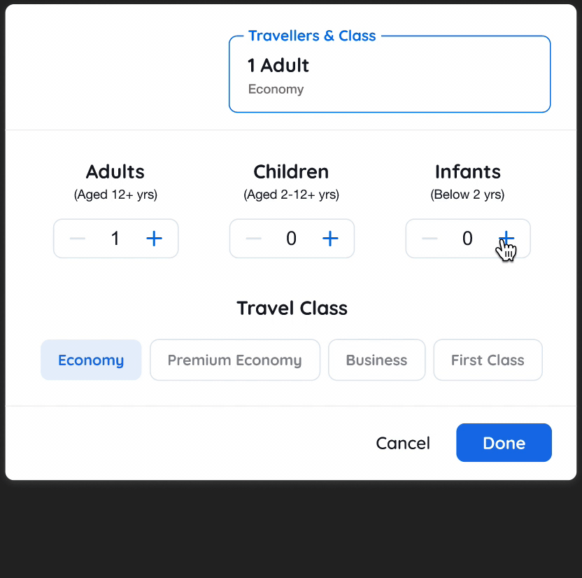
Moving on to the actual design of the widget. We ideated different ways to structure the content inside the widget. The goal was to group all elements into logical sections and place them efficiently, allowing for effective scanning and limiting errors. We chose the design which required fewer ‘visual fixations', empowering the user to scan the form in one go.
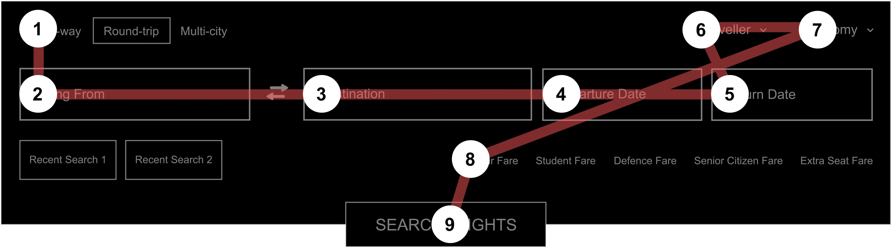
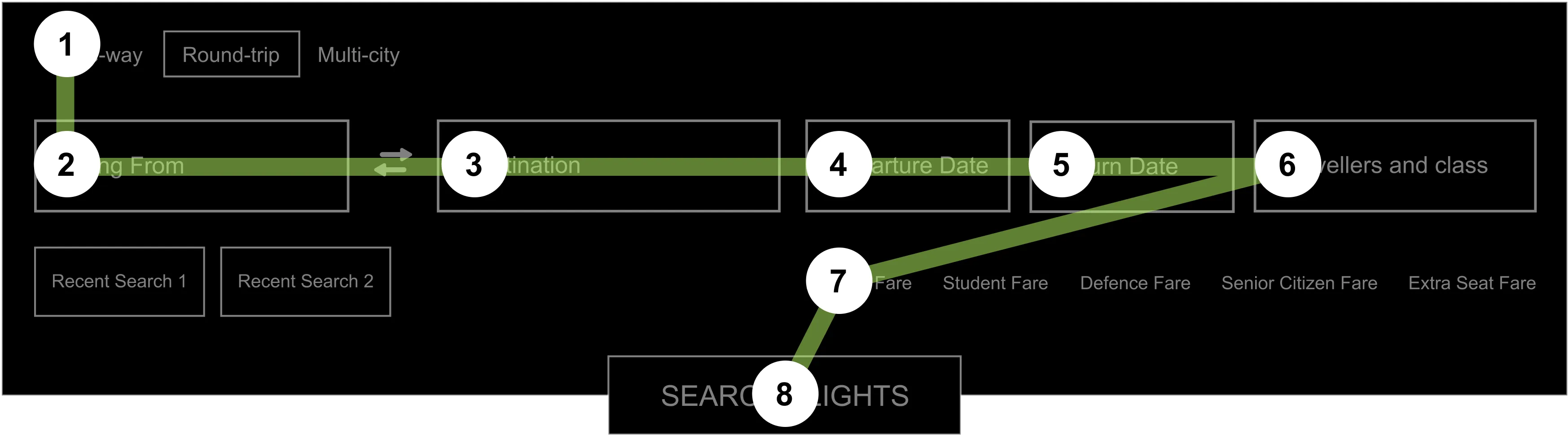
After that, I made wireframes for the entire experience to organise and communicate my ideas clearly to my team. Focussing on efficiency over Speed, the Key idea at this stage was to make the user focus on one task at a time and complete it effectively. Each step opens up a modal overlay window. Users can confirm or discard the changes that they made in the window.
Each highlight captures an aspect of the new search experience. It calls out which design goal it adheres to, what problem its solving and what is the solution.
Designing for Interruptions
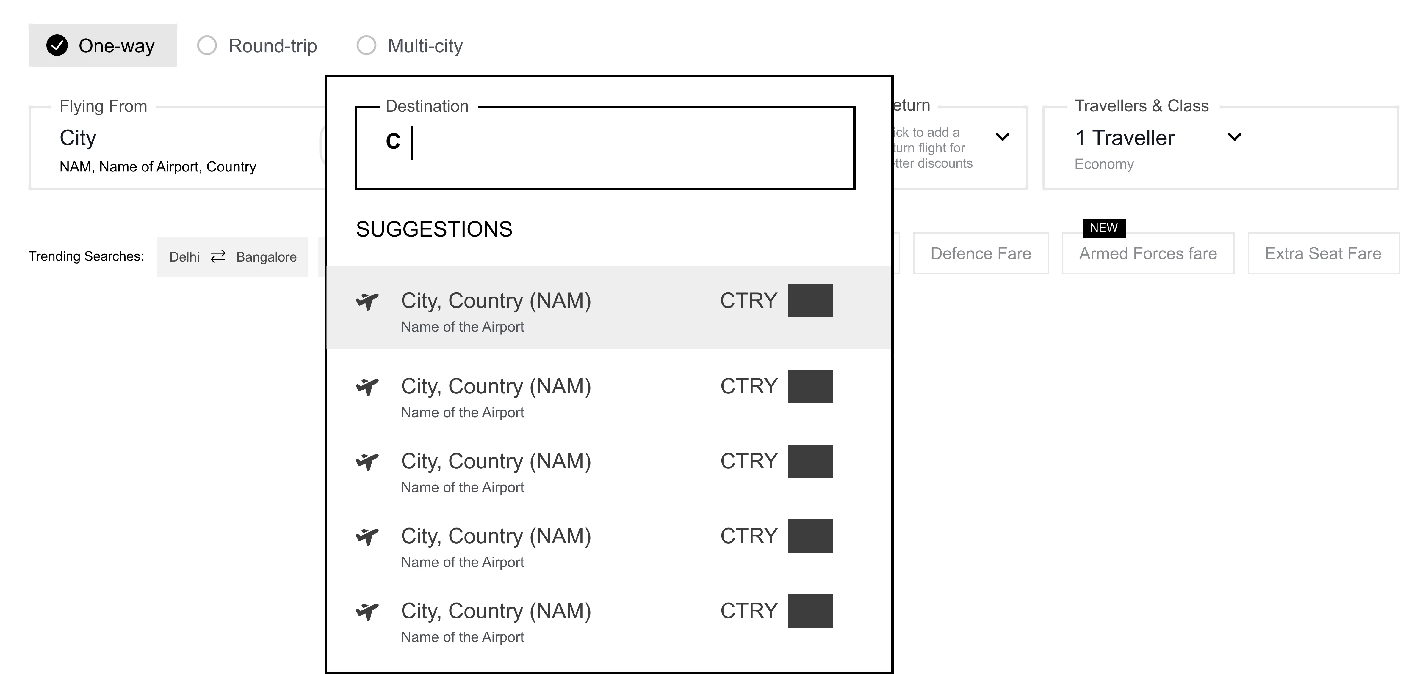
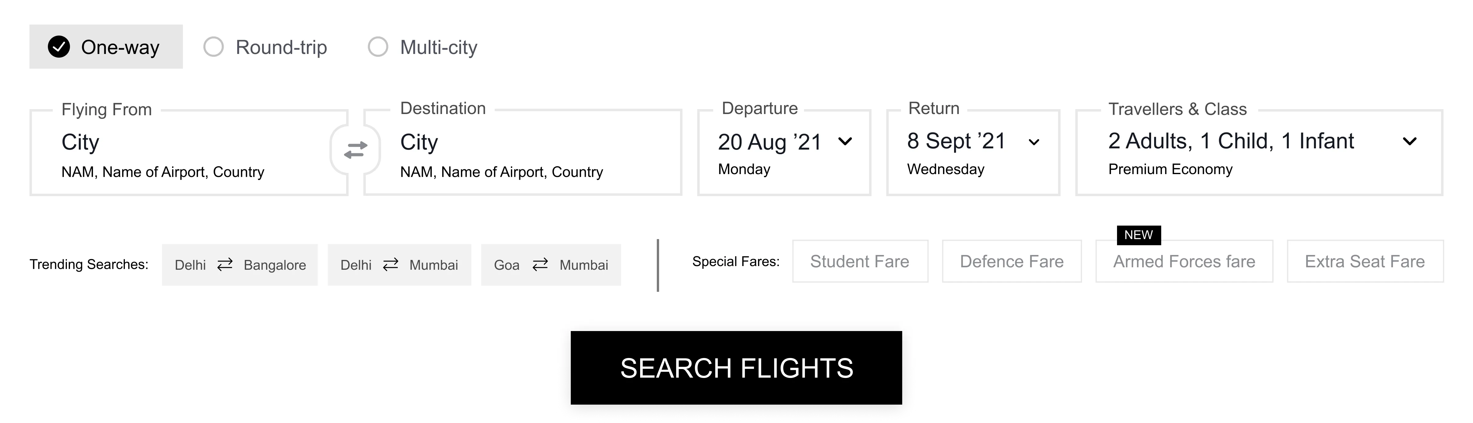
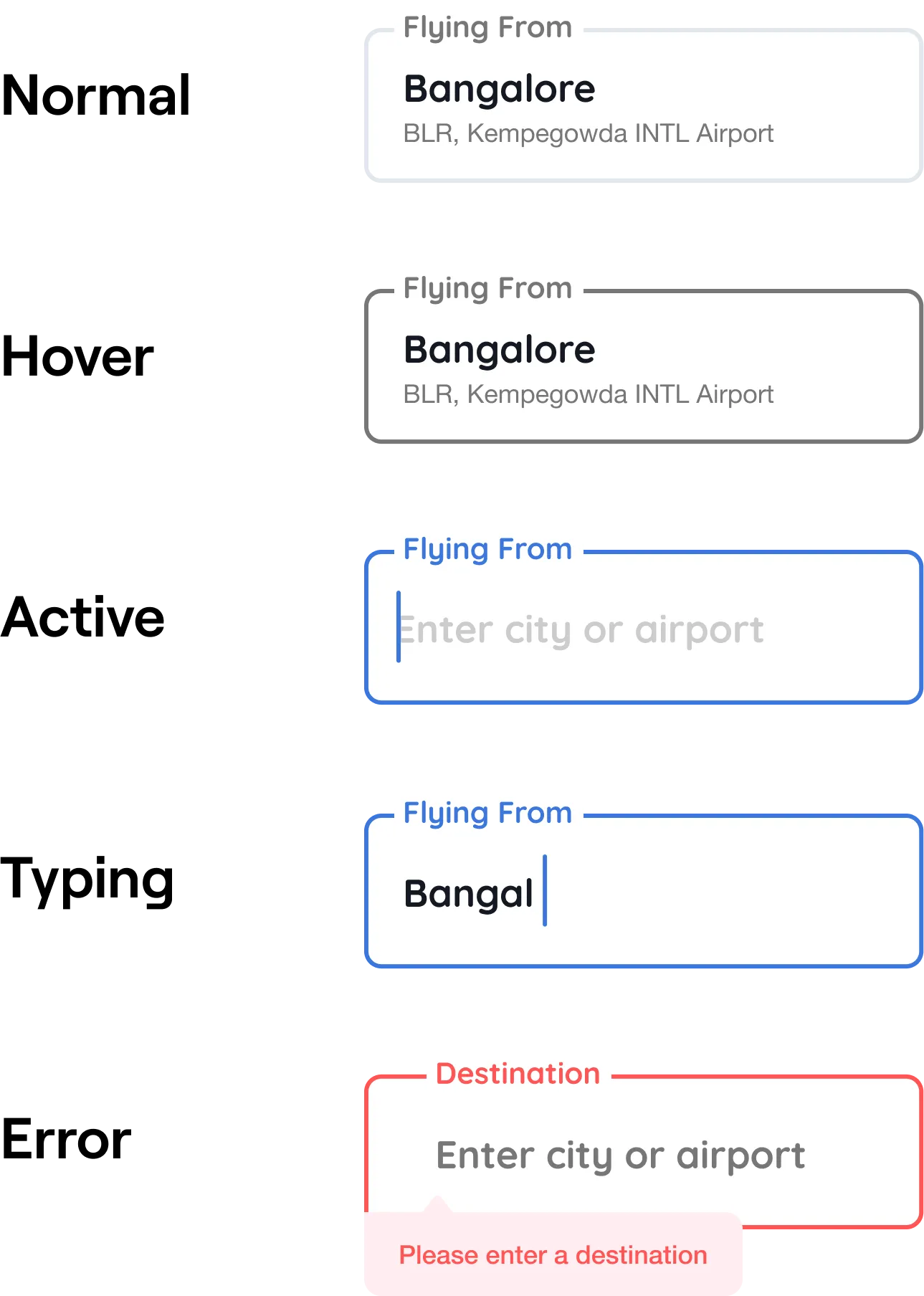
Problem : The flight search widget is essentially a form. Users may fill out this form amidst various interruptions and distractions. But as the fields don’t reflect their current state, users could struggle to get back to the task.
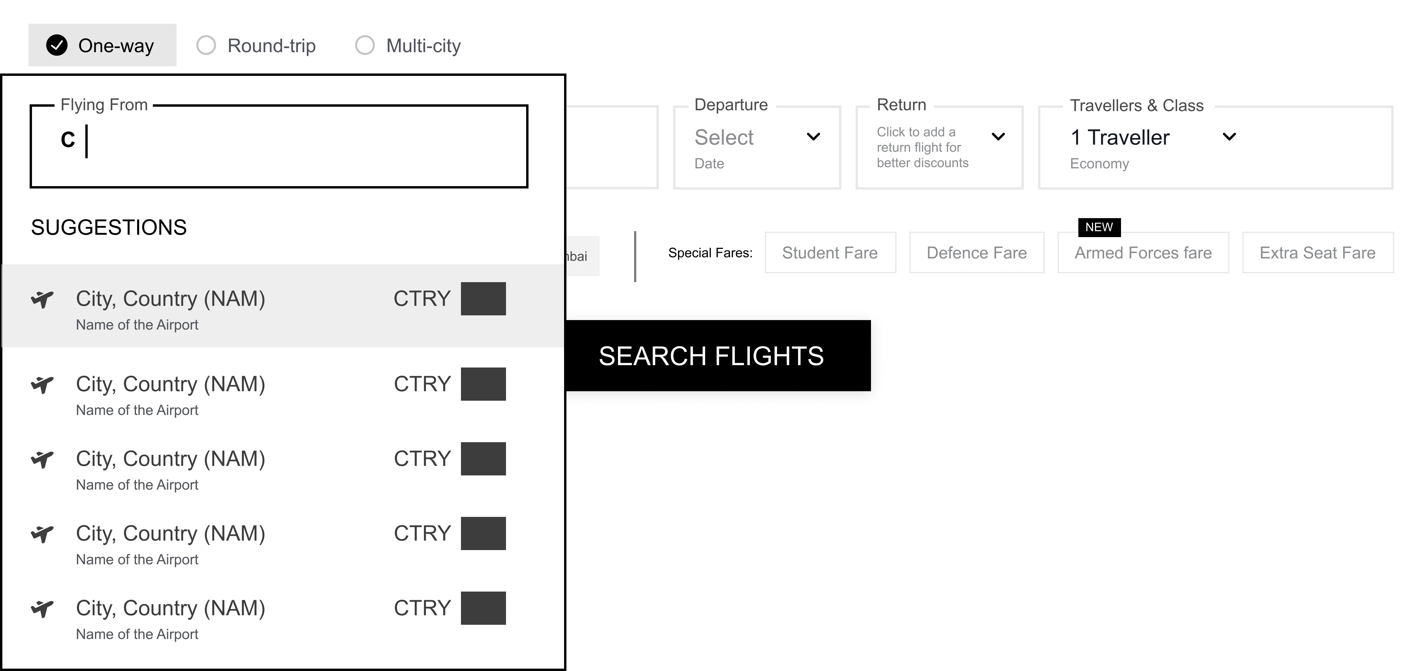
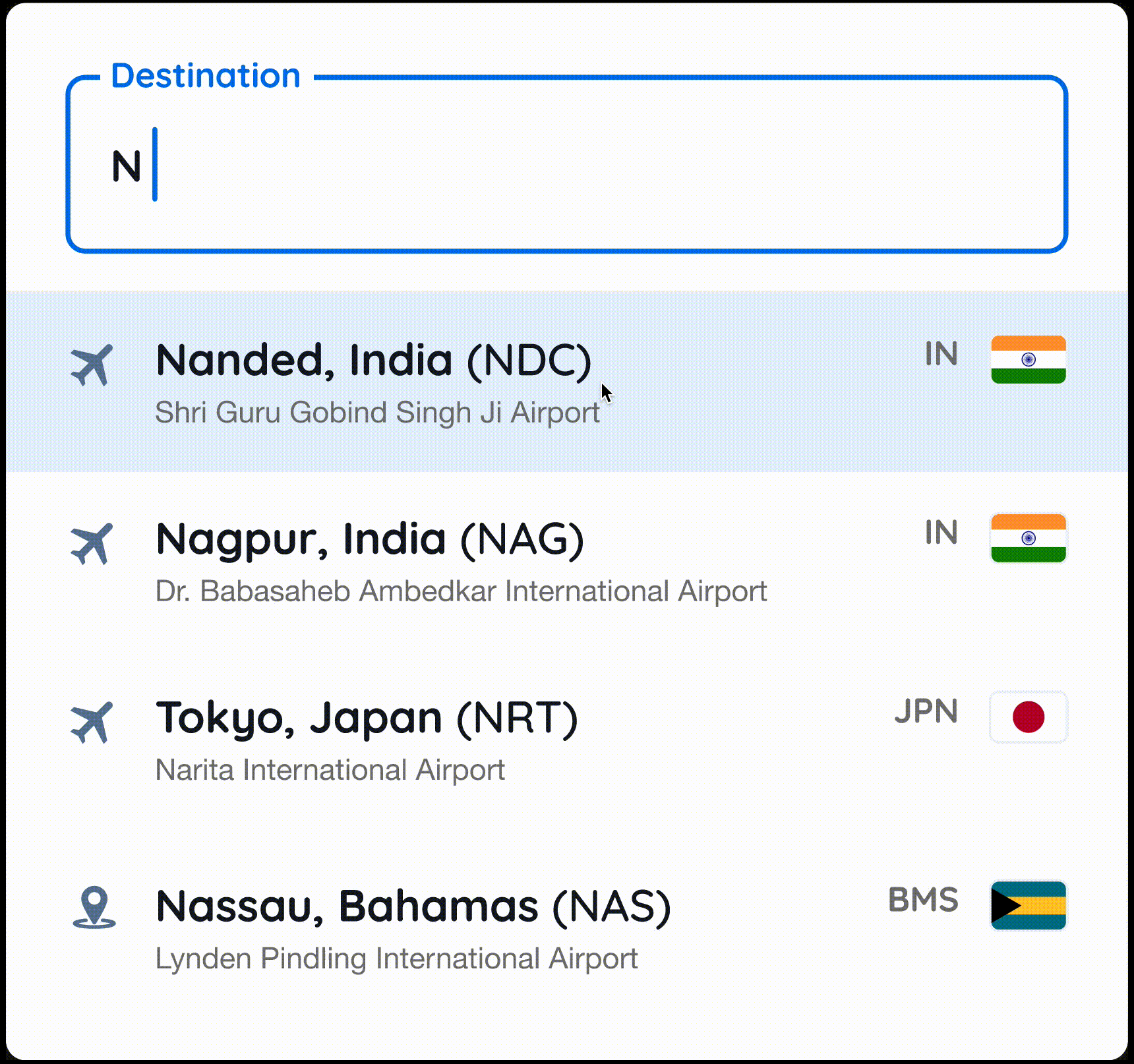
Solution : We introduced accessible input fields with clear top-aligned labels, placeholder text and visual cues.Mapping the errors to the input fields ensured that the users could correct their mistakes.
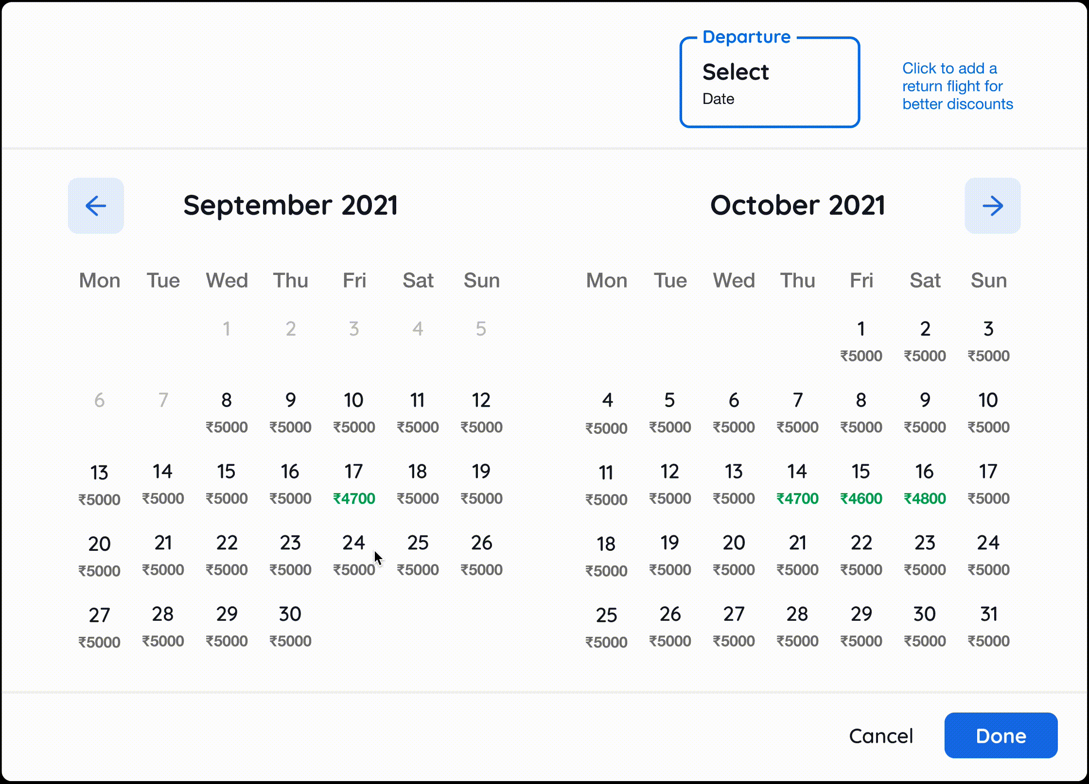
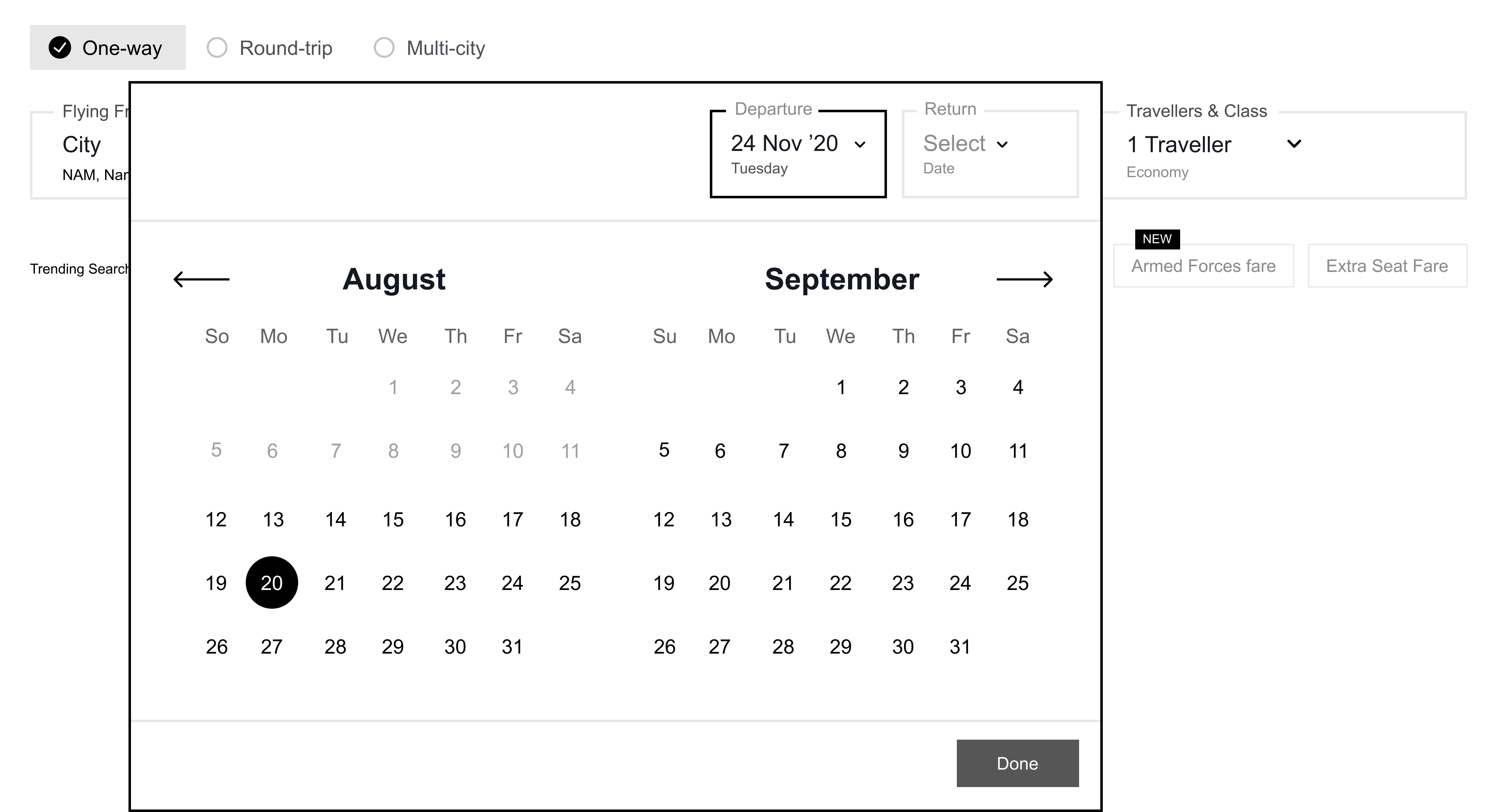
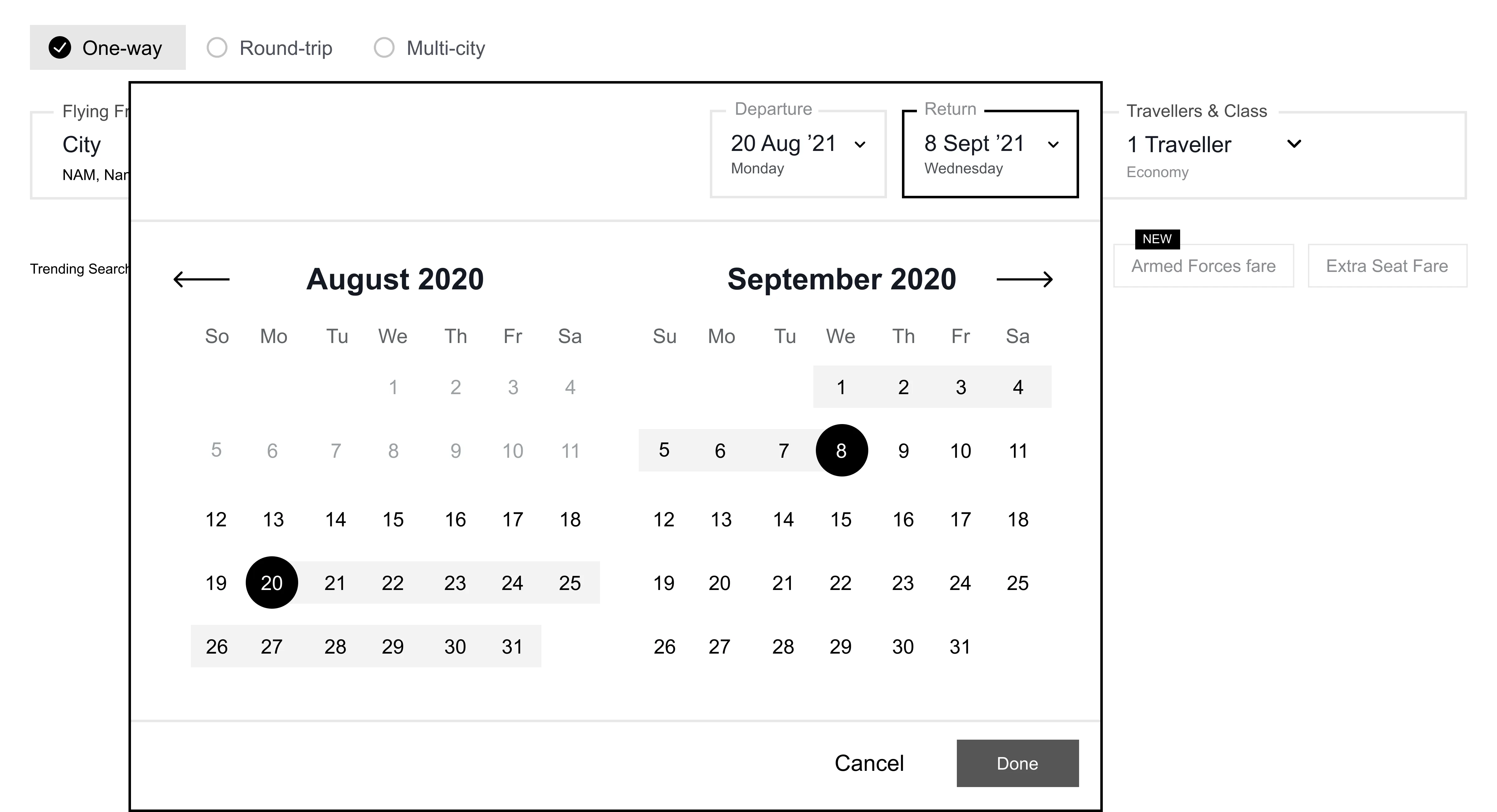
Helping users plan their trip using the calendar
Solution : The new calendar provides a dual month view that enables users to compare prices over months to plan their trip. With the introduction of modal states, users can now confirm their inputs.
We added delightful insights like the lowest prices and trip duration while paving the way for more such interventions in the future.
Simpler, clearer search results
Problem : Goibibo offers a lot of information about each result in their search results. But due to no organisation, these data points could disrupt the ability of the user to scan through many results.
Solution : We introduced a better visual hierarchy to make the results scan-able.
Designing for the road bumps
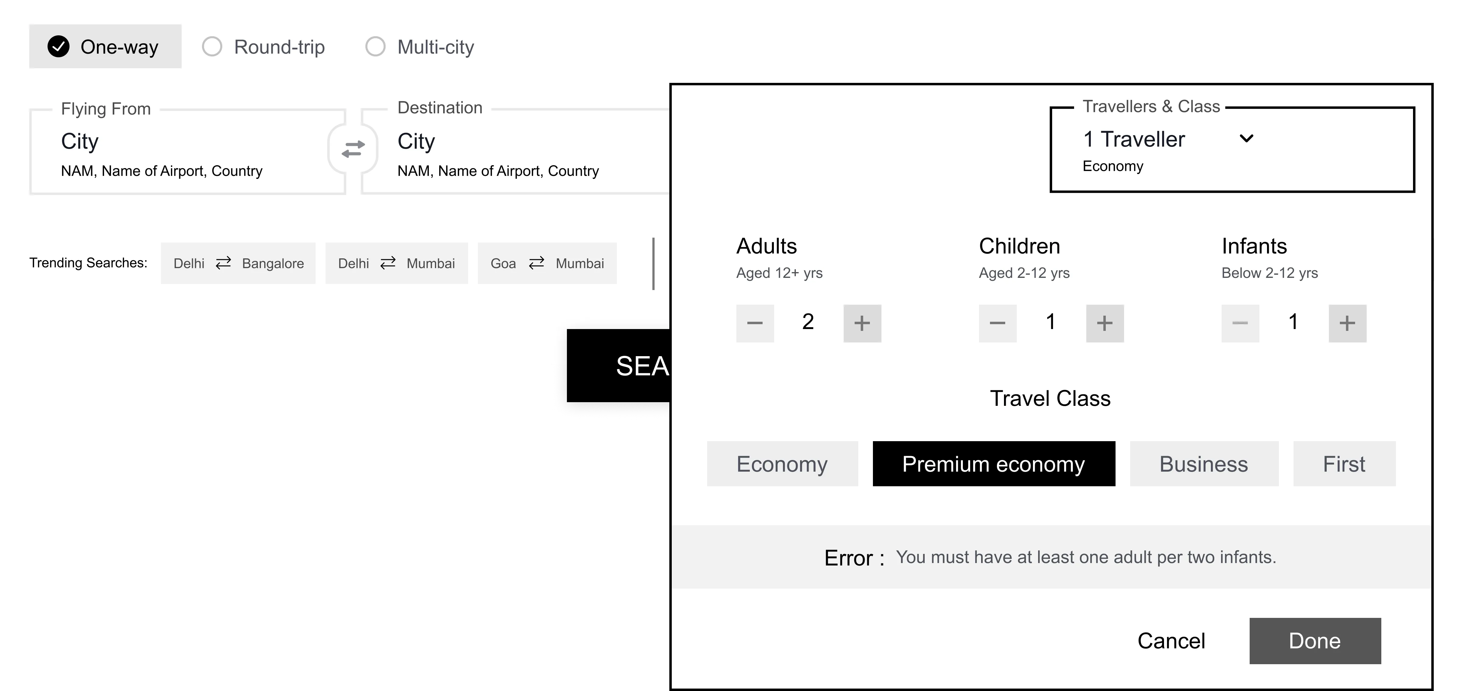
Problem : Airlines have certain guidelines for the passengers, users can struggle to understand these conditions which can lead to error states.
Solution : We mapped errors to the inputs to highlight the error and provided guidance in plain language to ensure nothing gets lost in translation.
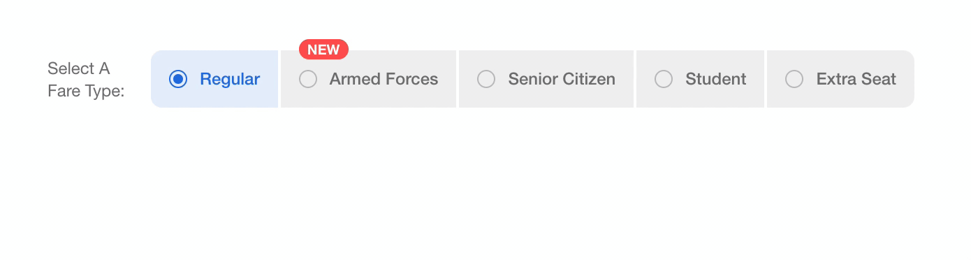
Helping users understand special fares
Problem : Special fares can provide an exclusive discount on flights. Airline carriers have their guidelines for the applicability of these fares but, users were unaware.
Solution : Now, fares can be added and removed as per the market and, new Hover states provide the well-needed context.
Widget interactions grew by 4% in the first week of release. We constantly monitored the click rate on various elements of the experience and the following were the key takeaways:
We saw that due to the increase in widget prominence, we lost some shoppers from the offers section. The reason - 33% of our users use low-end devices to book flights with us. Hence for some users, the offers section isn't coming inside the viewport. We are currently trying to solve such problems to improve the overall experience.